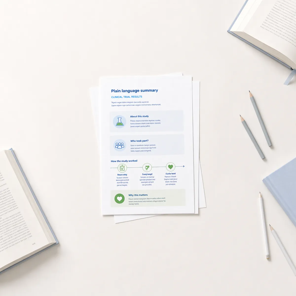
This post builds on ideas from Beyond Words: The Role of Design in Decoding Health Information and Design as Care: Making Healthcare Safer and More Human, showing how visual design helps people act quickly and confidently in health emergencies.
Most health information expects calm readers and plenty of time. Emergencies offer neither. Infographics bridge that gap, translating urgency into clarity through visuals that work faster than words.
When a woman notices her father’s face drooping on one side, or a colleague hears a coworker’s speech suddenly slur, it is in that instant that understanding becomes action. Will they recognize what's happening? Will they know what to do?
When information needs to work instantly
Critical health information carries a unique demand: there’s no luxury of time to process, no chance to re-read instructions, and no room for confusion. The stakes are immediate and potentially life changing.
Too often, traditional health materials stumble when it’s this urgent. Brochures sit unread in waiting rooms, long symptom lists fade into the daily clutter. Infographics cut through that. They transform urgent health guidance into formats our brains can process quickly, remember easily, and act on right away.
Real results from visual campaigns
One of the clearest examples of visual health communication is the F.A.S.T. campaign (Face, Arm, Speech, Time). It is an internationally recognized stroke awareness tool first developed in the United Kingdom in the late 1990s by stroke physicians and emergency personnel. The American Stroke Association later adopted and promoted the F.A.S.T. message across the United States as part of its national education efforts.
The campaign distills the warning signs of stroke into a simple visual acronym FAST:
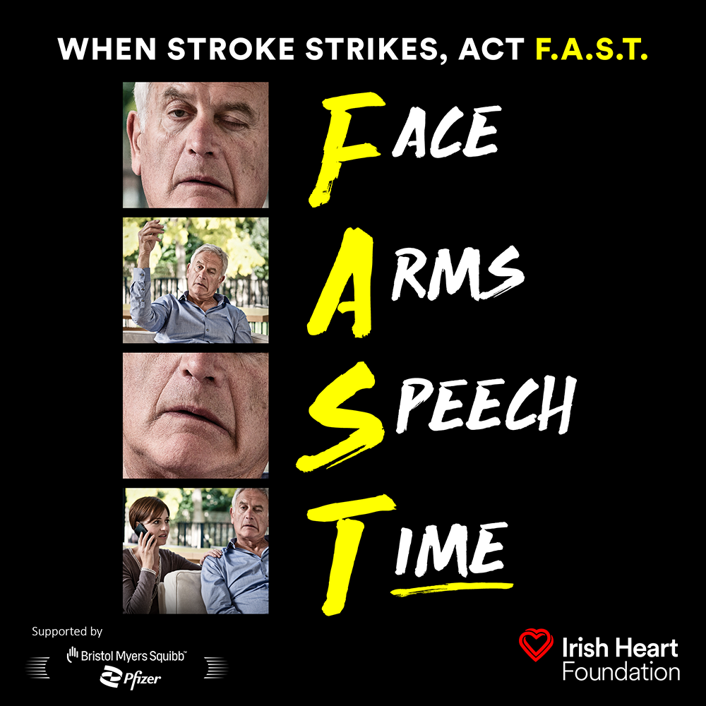
By pairing short text with clear and recognizable visuals, F.A.S.T. helps people identify stroke symptoms quickly and act without hesitation. Public awareness studies show that visual cues like these improve recognition of stroke warning signs and encourage faster emergency response times.
The strength of the campaign is its simplicity. People remember face drooping because they can picture it. They recall arm weakness because the image shows exactly what to look for. The infographic logic turns medical symptoms into concrete and observable signs, which leads to faster action and better outcomes.
How infographics save time in emergencies
Speed matters in health emergencies. In an ischemic stroke, for example, nearly two million brain cells die every minute that treatment is delayed. This urgency calls for communication that works instantly.
Infographics achieve this through:
- Visual hierarchies that guide the eye to what matters first
- Color coding that builds instant associations such as red for danger and green for safe action
- Sequential illustrations that show steps at a glance
- Icons that are clear and recognizable to replace or reinforce words
Consider how visual communication breaks down barriers. A person in distress does not have to read complex sentences. The infographic does the mental work, presenting essential actions in the simplest possible form.
Making complex protocols accessible
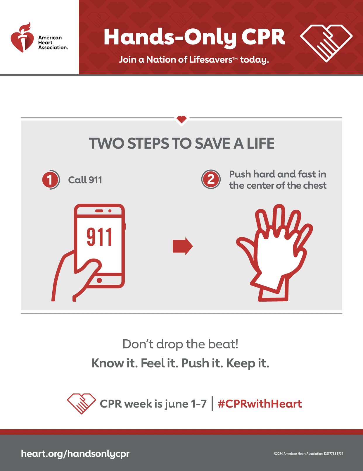
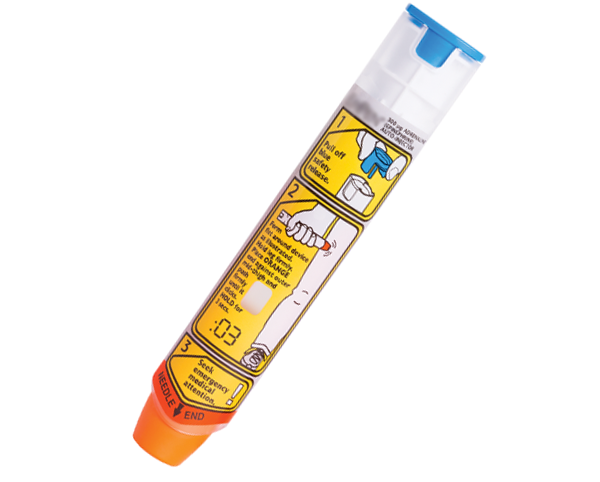
Some health emergencies require multiple steps, such as CPR or the use of an epinephrine auto injector. That is a lot to remember under pressure.
Infographics make multi-step processes easier to follow. The American Heart Association uses clear visuals in its CPR education materials. Its public Hands-Only CPR campaign focuses on two simple steps: call 911 and push hard and fast in the center of the chest.
In its full training programs, additional visuals break down the complete CPR process step by step, showing how to check responsiveness, position the person, and perform compressions correctly.
The same idea applies to medication emergencies. Instructions printed directly on auto injectors show where to place the device, which end to use, and how long to press. Visual cues reduce uncertainty and hesitation when seconds matter most.
Building recognition before the crisis
The most effective health infographics work long before an emergency happens. They build mental models people can access automatically when needed.
Think about fire safety icons. Most of us recognize an exit sign or a fire extinguisher symbol immediately. That recognition is learned through repetition, so when an emergency occurs, the response is automatic.
Health infographics aim for the same level of familiarity. During the COVID-19 pandemic, the CDC’s handwashing visuals used simple step-by-step images that became globally recognizable. People did not have to think through each step because they had already internalized it. That familiarity translated directly into action.
Research on symbol-based health communication shows that people remember better when they connect symbols with meaning, such as linking high blood pressure to a red traffic light or safe actions to green. These associations stay in memory longer than text-based warnings.
Designing for diverse audiences
Critical health information must reach everyone, regardless of language, literacy level, or cultural background. In emergencies, we cannot choose our audience or ensure they share the same language or reading skills.
That is where universal design principles come in:
- Icons and symbols work across language barriers
- Color cues create quick emotional recognition
- Sequential layouts follow logical visual patterns, often left to right or top to bottom
This does not mean one design fits all audiences. Cultural testing remains essential since colors and symbols can mean different things in different places. But the power of visual communication, which can reach people regardless of language, makes infographics uniquely suited for critical health messaging.
When we design for health literacy, we often create tools for moments filled with stress or fear. Clear visuals become a calm anchor amid the chaos.
What makes a “lifeline” infographic effective
Not every health infographic succeeds when the stakes are high. The most effective ones share key characteristics.
- They prioritize ruthlessly. A lifeline infographic does not explain everything. It focuses on the few most critical actions: what to look for, what to do, and when to call for help. For example: A flu clinic poster might limit its message to “Cough + Fever + Shortness of breath = Call now.”
- They use consistent visual language. Once red means danger or numbered circles mean sequence, keep that logic throughout. Consistency reduces cognitive load.
- They show, not just label. Instead of a box that says “facial drooping”, show what facial drooping looks like. Visual clarity eliminates guesswork.
- They are designed for scanning, not reading. The viewer’s eye should move quickly through the content and land on key information without reading every word.
- They are user tested. What seems obvious to a designer or clinician might not be clear to a patient or the person trying to help. Testing with real users reveals these gaps before an emergency does.
The bottom line
Infographics transform how we communicate critical health information because they align with how people process information in high-stress situations. When people are anxious or under pressure, long sentences and dense text become harder to absorb, but clear visuals and simple patterns can still guide quick understanding and action.
In emergencies, that difference can determine outcomes. Recognizing stroke symptoms, for example, often depends on whether someone has already internalized simple visual cues. The speed of a first-aid response can hinge on whether instructions are presented as dense text or clear, sequential images.
When health information can mean the difference between life and death, clarity is not just good design. It is an ethical responsibility. Infographics deliver that clarity when it matters most.