
This post builds on ideas from Beyond Words: The Role of Design in Decoding Health Information and connects with Infographics as Lifelines: Communicating Critical Health Information, which looks at how design supports action and understanding in critical health situations.
I've always believed that design has the power to help people understand important information. In healthcare settings, though, this goes far beyond communication; it directly affects patient safety.
Research shows that poor communication contributes to patient safety incidents, with one major study finding it to be a contributing factor in over 60% of hospital adverse events. Within these communication breakdowns, poorly designed materials—from medication labels to patient instructions—represent one crucial area where design improvements can make a measurable difference.
When design gets it right
Clearer design consistently improves comprehension and reduces errors. For example, a 2024 systematic review of 14 studies found that "thirteen of these studies significantly impacted the patient understanding of medication labels", with "patient-centered language, pictograms/graphics, color/white space, or font optimization" having "the most impact on patient comprehension."
One particularly compelling example comes from simulation research. In neonatal intensive care units, "human-centered design (HCD) labels" improved "human reliability for medication safety," with "assessed human error probability reduced by up to 56%."
Even small tweaks matter. Increasing font size or using contrast to highlight key information like expiration dates and dosages has been shown to significantly reduce confusion.
The cost of poor design
Design missteps aren’t just inconvenient, they’re dangerous. Patient misunderstanding of instructions on medication labels is one well-documented risk. And it’s not just labels. Discharge instructions are another frequent pain point. Patients often leave the hospital unsure of what medications to take or when to schedule follow-up appointments. Poorly designed handouts don’t just frustrate people, they can delay recovery and increase the risk of readmission.
The consequences extend far beyond individual patients. A review of 23,000 medical malpractice lawsuits found that over 7,000 could be attributed to communication failures, resulting in $1.7 billion in costs and nearly 2,000 preventable deaths.
Look-alike medication labels present a particular challenge. Similar packaging and typography between different medications has led to dangerous mix-ups. The FDA responded by encouraging Tall Man lettering (capitalizing specific letters to distinguish similar drug names.)
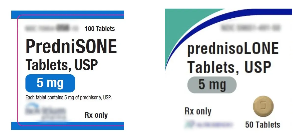
And while laboratory studies showed promise for Tall Man lettering, real-world evidence is mixed. A nine-year review across 42 children's hospitals found no statistically significant change in error rates after implementation. It’s a reminder that design solutions need real-world validation, not just lab results.
Why healthcare communication is different
Healthcare communication must work under difficult circumstances. Stress, anxiety, and physical discomfort impair memory and comprehension, making it harder for patients to absorb complex information. One controlled study showed that stress directly reduces working memory capacity.
You can see the same principle in something as practical as wayfinding. Hospitals are difficult to navigate, and unclear signage only adds to patient stress. Research on hospital navigation shows that consistent symbols, color coding, and well-placed maps ease navigation and reduce frustration.
Real impact on outcomes
Understanding isn’t just nice to have, it’s the key to effective treatment. Studies on discharge instructions found that comprehension was the single strongest predictor of whether patients followed through with care.
The same is true for appointment reminders. Dense text can be easy to overlook, but when designs highlight essentials—date, time, location, next steps—attendance improves and treatment plans stay on track.
Making healthcare more human
Good design in healthcare isn't just about preventing errors, it's about showing respect for patients during vulnerable moments. Clear, thoughtful visual communication says, we care about your understanding and your wellbeing.
Consent forms are a good example. Too often, they’re treated like legal paperwork rather than a tool for patient understanding. By rethinking these forms with plain language and clear structure, providers can ensure patients aren’t just signing but truly understanding their choices.
The challenge is significant. The Institute of Medicine report “Preventing Medication Errors” warned that poor design is a central cause of medication errors in the U.S. But the solution is within reach: evidence-based communication that respects patients’ needs in moments of stress. In those moments, design becomes more than communication. It becomes a form of care.
The bottom line
Human-centered design in healthcare is essential infrastructure. By centering real patient needs and cognitive limits, it can mean the difference between confusion and clarity, between safe treatment and preventable errors.