
This post introduces my reflections on how design helps people understand and act on health information. It connects with Design as Care: Making Healthcare Safer and More Human, which explores how thoughtful design improves safety, empathy, and trust in care, and Infographics as Lifelines: Communicating Critical Health Information, which focuses on clear visuals when every second matters.
Healthcare is already complicated, and adding communication barriers only makes it more challenging. From ER posters with tiny text to medication instructions filled with jargon, health communication often overwhelms instead of informs.
The result? People leave healthcare visits more confused than when they arrived. Health information often fails when it relies only on words.
The communication gap
Health literacy isn’t just about being able to read, it’s about knowing what to do with the information in front of you. Imagine a patient deciding whether to refill a prescription, schedule a follow-up test, or change what they eat. If the instructions are buried in long paragraphs or filled with unfamiliar medical terms, it’s easy to give up or set it aside. That’s when mistakes happen, such as missed doses, skipped appointments, or delays in care.
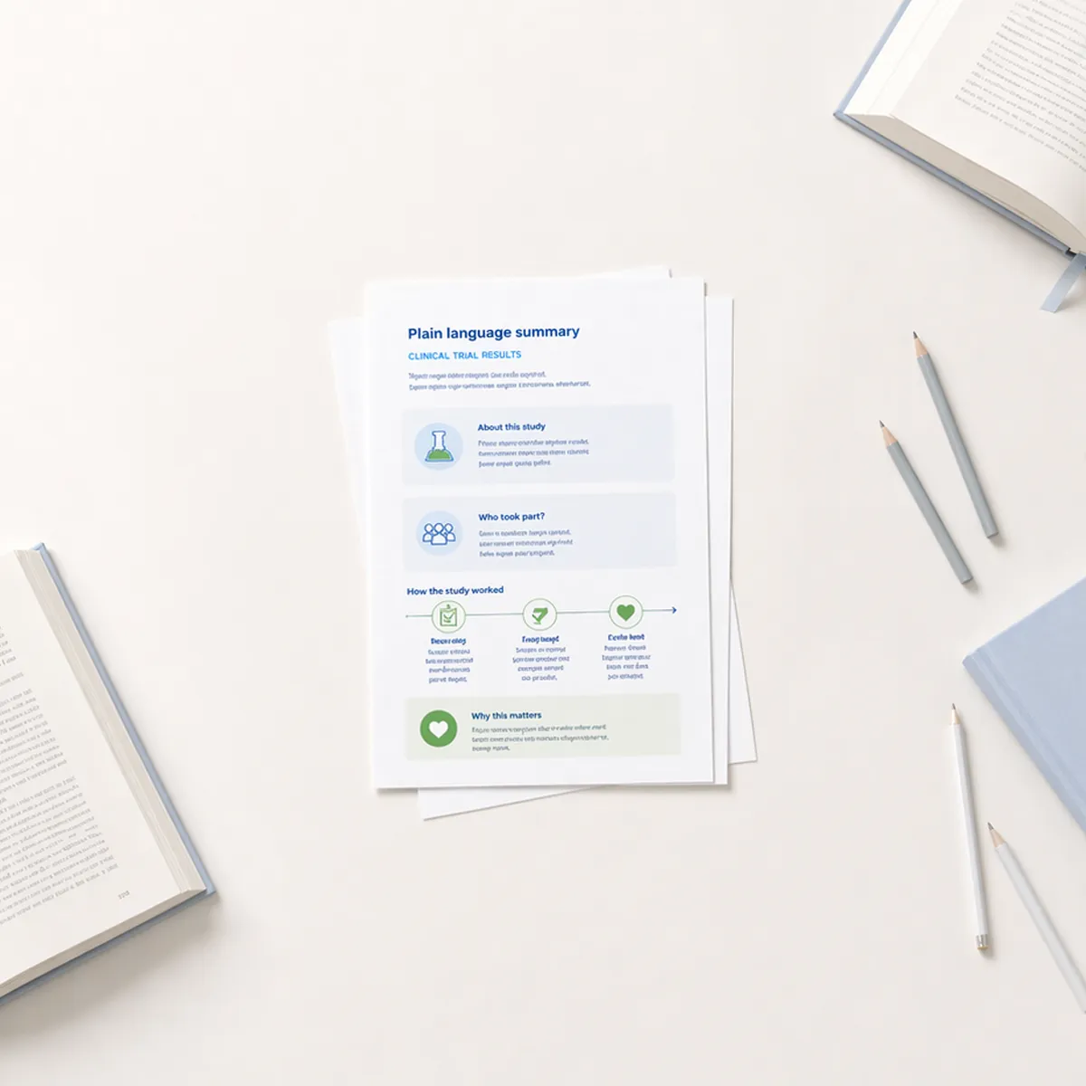
This is where design makes a difference. Visual formats cut through the clutter and give patients a way to act quickly and confidently. A calendar graphic can make a medication routine clearer than a page of text. A short diagram can show the steps of a procedure more effectively than a paragraph. The point isn’t to make things "look nice", but to make health information usable.
What makes design universal
Good health communication uses visual elements that transcend language barriers. When people are stressed, in pain, or navigating an unfamiliar healthcare system, words alone often fail. Universal design relies on symbols, colors, and simple sequences that cut through that noise.
Icons are especially powerful because they tap into recognition, not translation. A thermometer, a bandage, or a heart symbol communicates meaning instantly. That’s why airports, hospitals, and public spaces around the world rely on icon systems that anyone can understand, regardless of language or literacy.
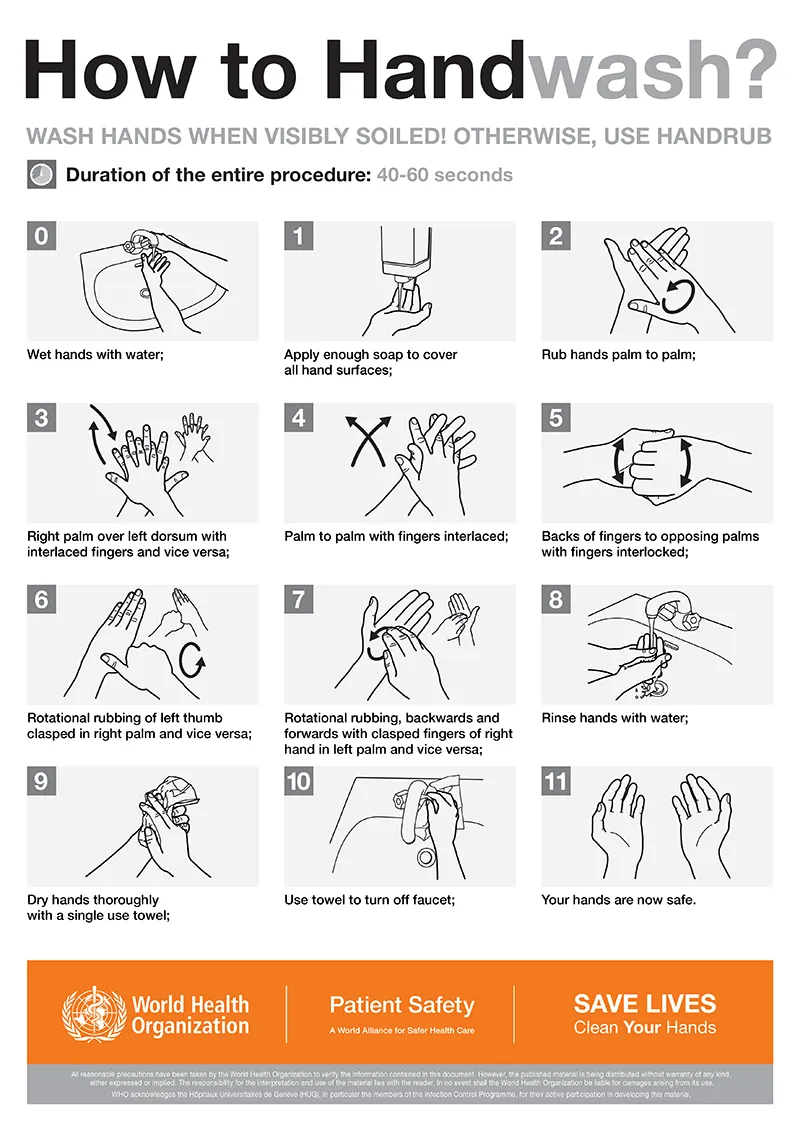
Sequences add another layer of clarity. The COVID-19 handwashing posters worked globally because the visuals created a clear, logical flow: soap, scrub, rinse, repeat. No one needed to stop and translate instructions. The images told the story. That’s the strength of universal design; it makes health information accessible at a glance, exactly when people need it most.
Designing for everyone
Universal design principles ensure materials work for diverse audiences from the start.
When creating health literacy materials, think about the grandmother managing multiple medications, the teenager learning about nutrition, the parent navigating insurance forms, and the child understanding why they need to take medicine. Every individual has unique needs.
Design should lower barriers, not add them. Accessibility means creating materials that work for people across ages, cultures, and abilities.
Real examples that work
Some of the most effective health campaigns rely on visual communication.
The World Health Organization's COVID-19 prevention materials combined simple pictograms with minimal text, making them understandable across multiple languages and literacy levels worldwide.
Hospital wayfinding systems now use universal symbols extensively. Major U.S. hospitals including Children's Mercy Hospital in Kansas City and Grady Health System in Atlanta have implemented graphic symbols that patients find much easier to understand.
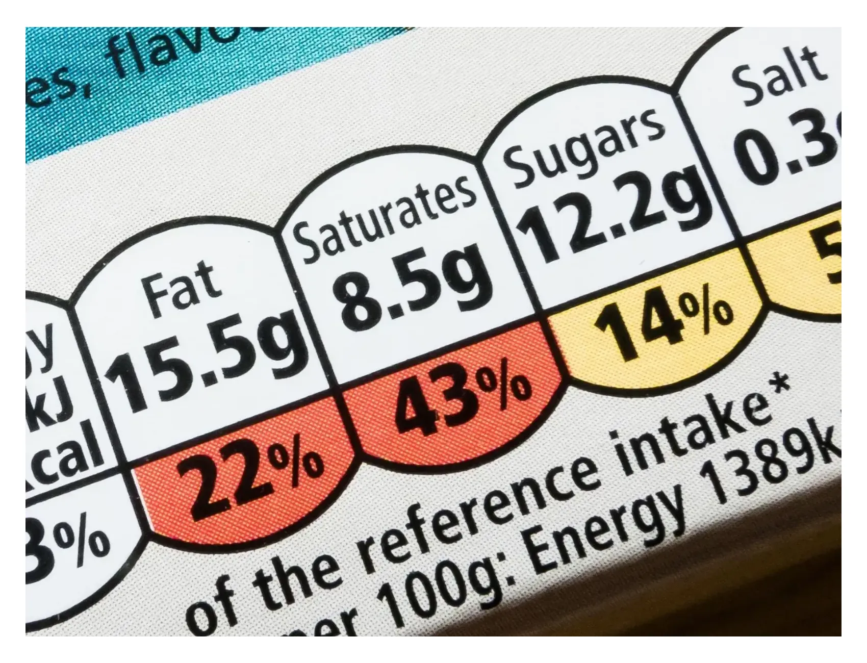
Food labeling systems like the UK's traffic-light approach use color coding to communicate nutritional information instantly. Green means low levels (good choice), amber means moderate (consume carefully), and red means high levels (limit intake). No nutrition degree required.
Creating better health materials
Real-world campaigns prove design makes health information more accessible, but principles matter just as much as examples. These four guidelines can help ensure your materials work for everyone:
- Start with your audience. Test designs with people who represent your intended users. Their feedback shows you what works and what doesn’t.
- Embrace cultural sensitivity. Symbols and gestures don’t mean the same thing everywhere. For instance, the thumbs-up sign is friendly in the U.S. but offensive in parts of the Middle East.
- Prioritize clarity. Skip jargon. Say "heart health" instead of "cardiovascular health", and pair it with a simple heart icon for quick understanding.
- Make it appealing but still practical. Clean fonts, plenty of white space, and uncluttered layouts help people focus on the message.
The bottom line
When health information works for diverse audiences, we remove barriers to understanding. We reduce anxiety. We help people make better decisions about their care.
Clear design isn't just good practice, it's essential for equity and accessibility. When individuals can understand their medication instructions, follow treatment plans, and recognize warning signs, their health outcomes tend to improve.
That's the real goal: design that empowers people to take better care of themselves and their families.