
In my previous post about visual content, I shared how visuals stick with us more than text. But with data, there’s a big difference between a chart that looks polished and one that truly helps people understand.
I've worked on a wide range of projects—health materials, corporate reports, infographics—and I've found that the same four elements consistently make visualizations effective.
1. Start with purpose, not data
This might be the most important lesson I've learned: always start with your communication goal, not your dataset. Before you open a single spreadsheet, clearly define what you're trying to achieve.
Ask yourself:
- What specific question are you trying to answer?
- What decision will this help someone make?
- What's the one key insight you want people to remember?
Too many projects start with “we have all this data” instead of “our audience needs to understand X so they can do Y.” That backwards approach creates cluttered visuals that show a lot, but communicate very little.
Imagine a healthcare organization comes to you with dozens of diabetes statistics. It's all valuable information, but it would make for an overwhelming visualization. Instead, you step back and ask: What's the most important thing we want people to know? The answer might be simple: small lifestyle changes can significantly reduce diabetes risk. Everything else becomes supporting detail, and the final piece is much clearer.
I start by writing down what I'm trying to say in one sentence. If I can't do that, the visualization usually confuses me too.
2. Choose quality data strategically
Not all data is worth including. I'd rather use three solid, reliable sources than throw in everything I can find.
People are getting pickier about where information comes from, especially anything health related. They want to know: Is this reliable? Does it apply to me? So always show your sources, and explain what the numbers mean. Don’t say “85% effective.” Say, “In studies, 85 out of 100 people who tried this saw improvement.”
I stick to sources I trust—government agencies, research studies, and established organizations. If I find numbers that don't match up, I'll say so. Being upfront about conflicting data makes people trust you more.
3. Design for your audience first
A chart that works perfectly for researchers might completely overwhelm patients. Successful data visualization requires deep empathy for your audience.
Think about who's going to look at this, what they already know, and what barriers might prevent them from understanding your message. Are they experts or new to the topic? Are they making a stressful decision or casually browsing?
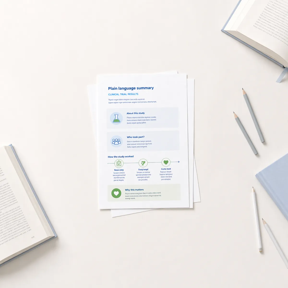
This audience-first approach drives everything I do. When I'm designing plain language summaries of clinical trial results, I'm thinking about participants and their loved ones who need to understand what the research means for them. When designing other type of health literacy materials, I'm considering patients who might be stressed or unfamiliar with medical terminology.
The same dataset can look completely different depending on the audience. Parents may want reassurance about safety, while public health officials care about community protection. Same data, different story.
4. Test and refine
The first version is rarely the best, no matter how experienced you are. Testing doesn't have to be formal; sometimes the most valuable insights come from watching someone interact with your visualization while thinking out loud.
Show your work to colleagues who aren't familiar with the project. Ask them to summarize what they learned. If their summary doesn't match your intended message, you know where to focus your revisions.
Pay attention to what confuses people or what questions they ask. The feedback may sting, but it makes the final version stronger.
When to work with a professional
Creating effective data visualizations requires analytical thinking, design skills, and communication expertise. For high-stakes projects—patient education, investor presentations, public health campaigns—working with an experienced information designer can make the difference between confusion and clarity.
As someone who specializes in plain language communication, I've seen how the right approach transforms complex information into tools people can use. It's not just about making data look good; it's about making it useful.
The bottom line
Good data visualization isn’t about trends or fancy tools. It’s about helping people see what matters and leaving out what doesn’t. The real challenge isn’t finding more data; it’s knowing how to distill it into something clear, accurate, and meaningful. The best visualizations feel almost invisible, guiding the viewer without distraction, but that clarity comes from deliberate choices, careful design, and above all, respect for the audience.